The homepage now displays a new navigation bar immediately next to the banner. This new navigation bar displays links and icons that users can use to navigate to various modules without going into the hamburger menu.
The Top navigation bar consists of the following links and icons:
Home - An additional Home link that users can select to come back to the homepage from any of the pages to which they have navigated.
Requisitions - This link opens the new requisitions grid. Users can select and choose which combination of reqs they would like to view.
My Candidates - This link opens the My Candidate grid. Users can view and take various actions on the candidates individually or upon a group of selected candidates.
Metrics Dashboard - This link opens the Metrics Dashboard for the users.
Quick Links - The Quick links icon is added to the top navigation bar. There is no change to the functionality of the quick link icon. Users can add links of their choice to the quick links sidebar that is displayed when the users select the quick links icon.
Dark Mode Toggle - A new toggle switch is added for the users to toggle between dark mode and light mode. All screens across the BrassRing application are switched to either dark mode or light mode based on the selection of this switch. The users' selection is retained after the users log off and log back in.

Requisitions
The Requisitions grid allows users to choose the combination of reqs they would like to view.
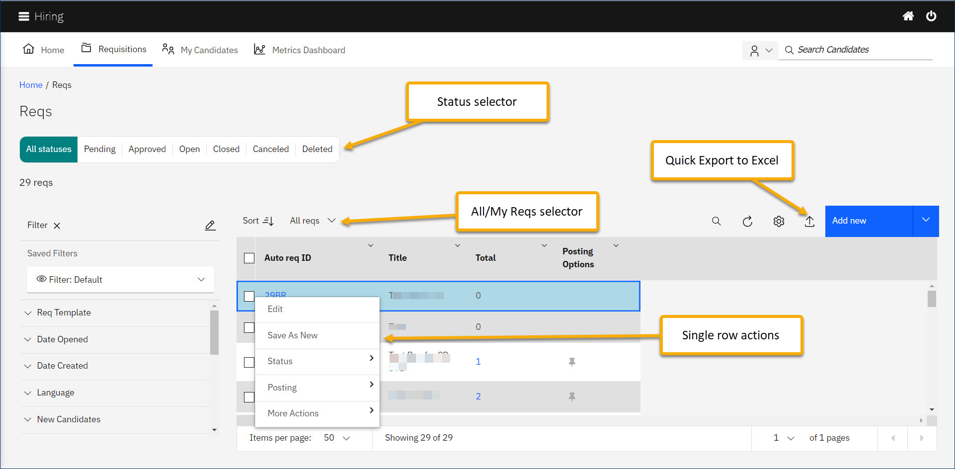
The Requisition grid has a Status selector from which users can select either All Statuses or one of the six statuses a req might be in. From this selector, users can choose either to view reqs within all the req statuses or they can choose to view reqs that are in a specific status.
Based on users' selection on the status selector, reqs in that specific status are displayed.
Similarly, users have the option to choose between My Reqs and All Reqs.
The grid displays the reqs in the combination of the users' choices of status and the selection among My Reqs or All Reqs.
Filters can be applied to narrow down the displayed results. Filters can be saved and managed all in one place.
Filter/Search Icon is used to search for a specific result within the grid.
Users can right-click anywhere on any row of the grid and a context menu appears. Various actions that users can take on that row are displayed. Actions are grouped into appropriate categories.
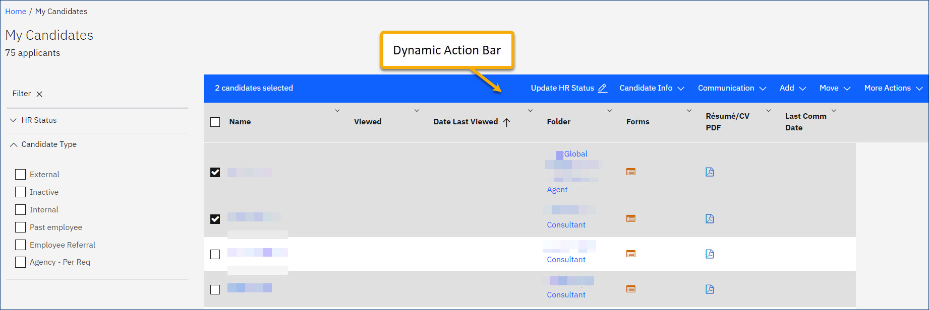
Users can select either a single row or multiple rows to see the action header dynamically popping above the grid. This header displays all the actions users can take based on their selection (grouped into appropriate categories).
A new Quick Export to Excel icon is readily available on the grid for users to export the contents of the grid to an MS Excel file.
The gear icon above the grid can be used to personalize the grid by choosing and re-ordering the columns of the grid.
 My Candidates
The My Candidates grid lists all the candidates that are associated with the reqs to which the user has a "My" relationship. Similar to the Requisitions grid, the My candidates grid has a comprehensive face-lift keeping usability in view. New features like the Dynamic Actions bar and Quick action icons like the Export to excel are added to this grid.

Note
Learn more about the new features and enhancements available in all grids from the section - Homepage - Tabs and Grids Redesign.