Abstract
You can specify theme colors.
These colors display at the global level and at the application level.
Note: All entries with default values are displayed with italic font and the Reset button is disabled. If an entry has a custom value, it is displayed with non-italic font and the Reset button is enabled.
Relevant elearning
Configure The Theme (Video, 01:30)
Default theme colors
Abstract
You can specify the theme colors, or use the default colors.
Default Colors
The following illustration shows how the default colors correspond to a page in an application.
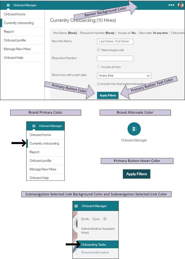
Table 34. Default Colors
Color Field | Color | Explanation |
|---|---|---|
Brand Primary Color | #137886 | (teal) |
Brand Alternate Color | #137886 | (teal) |
Banner Background Color | #137886 |
(teal) |
Subnavigation Selected Link Background Color | #137886 |
(teal)) |
Subnavigation Selected Link Color | #FFF |
(white) |
Primary Button Color | #137886 |
(teal) |
Primary Button Hover Color | #164D56 |
(dark aqua) |
Primary Button Text Color | #FFFFFF |
(white) |
Primary Button Text Hover Color | #FFFFFF |
(white) |
Note
Banner Background Color refers to the banner/header row that contains the logo.
Specifying theme colors for various areas on the page
Abstract
You can specify the theme colors.
Theme colors include primary color, background color, link color, and so on.
The Theme - Colors menu item displays a page that allows you to specify theme colors. The color selector icon  is supported in Chrome: Release 28.0 or greater.
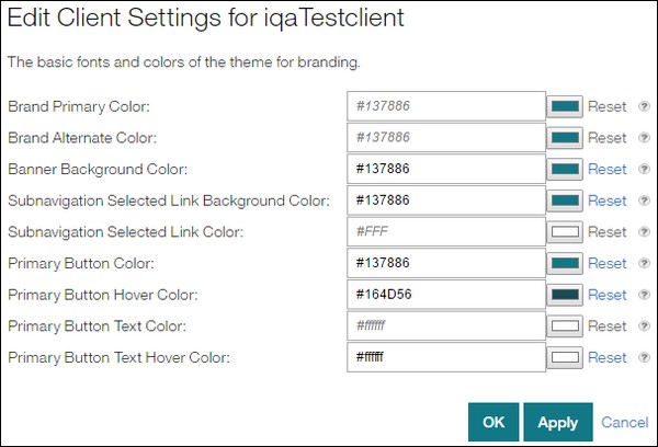
Select Theme - Colors in the menu to display a page that allows you to specify/edit theme colors.
Select the branding colors you want:
Primary color in the Brand Primary Color field.
Alternate color in the Brand Alternate Color field.
Color for the banner/header row that contains the logo in the Banner Background Color field.
Background link color of the subnavigation in the Subnavigation Selected Link Background Color field.
Selected link color of the subnavigation in the Subnavigation Selected Link Color field.
Button color in the Primary Button Color field.
Button hover color in the Primary Button Hover Color field.
Button text color in the Primary Button Text Color field.
Button text hover color in the Primary Button Text Hover Color field.
With some browsers, a color selector (launched by selecting the color selector icon
 ) lets you easily select colors. (Refer to the Using the Color Selector to Choose Colors topic that follows for details.) For browsers that do not support the color selector, the icon does not display.
With all browsers, you can manually enter color values. (Refer to the Manually Entering Colors topic that follows for details.)
If you do not want to save the entries you made, select the Cancel button. The Task List Labels page redisplays.
You need to select the Apply button or OK button to save the changes. If you:
Select the Apply button, a message informs you the settings were successfully saved, and you remain on the current page.
Select the OK button, the Task List Labels page redisplays.
To continue specifying/editing the settings, select a menu selection.
Using the color selector to choose colors
Abstract
In some browsers, you can use a color selector to choose the branding colors you want.
The color selector is supported in Chrome: Release 28.0 or greater.
For browsers that do not support the color selector:
The color selector icon does not display.
You can manually enter values into the color fields. (Refer to the Manually Entering Colors topic that follows for details.)
Select Theme - Colors in the menu to display a page that allows you to specify/edit theme colors.
Select a color selector icon
 . If no color is selected in the color selector, it shows black.
A color selector displays.
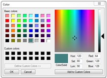
An indicator indicates where the color is in the spectrum. The Color/Solid portion of the color selector shows the color.
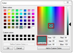
To change the color, select the indicator, and drag it to a different part of the spectrum. The Color/Solid portion of the color selector changes to reflect the new color.
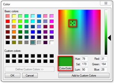
To change the color within its current location on the spectrum, select the pointer and slide it as needed. The color changes to reflect the action.
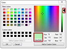
Each time you change the color, the RGB (Red, Green, Blue) and HSL (Hue, Saturation, Luminescence) numbers also change. You can also directly enter values into the RGB and HSL fields to change the color.
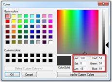
To make the color a custom color, select the Add to Custom Colors button.
To save the color, select the OK button on the color selector. The color selector window closes, and the selected color appears in the color selector icon and the hexadecimal value appears in the field.
Repeat this process for each color you want to change.
If you do not want to save the entries you made, select the Cancel button. The Task List Labels page redisplays.
You need to select the Apply button or OK button to save the changes. If you:
Select the Apply button, a message informs you the settings were successfully saved, and you remain on the current page.
Select the OK button, the Task List Labels page redisplays.
To continue specifying/editing the settings, select a menu selection.
Manually entering colors
Abstract
Using the Theme - Colors menu, you can manually specify colors for various areas of pages.
Most companies use very specific colors for branding. For example, a particular shade of blue. A company's marketing department can provide exact color values.
Not all browsers support the color selector. For such browsers, you can manually enter the following color types:
HEX RGB colors. For example, #fff (white) or #FFFFFF (white) or #000000 (black).
RGB colors. For example, rgb(123,123,123) or rgb(50%,50%,50%).
RGBA colors. For example, rgba(123,123,123,0.9) or rgba(50%,50%,50%,0.5).
LESS variables. For example, @ts-color-1 or @brand-primary-color. Note: It is recommended not to use a variable. Instead, enter a specific value.
Basic keyword values for standard colors (the color names are case-insensitive).
Default colors.
Table 35. Standard Colors - Keyword Values
Color
Explanation
Aqua

Black

Blue

Fuchsia

Grey

Green

Lime

Maroon

Navy

Olive

Purple

Red

Silver

Teal

Yellow

White

Transparent
Transparent
Default Colors:
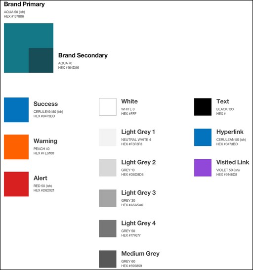
Table 36. Default Colors
Color | Color Image | Value |
|---|---|---|
Teal |
| #008571 rgb (0, 133, 113) |
Blue |
| #336fbb rgb (51, 111, 187) |
Dark Teal |
| #005448 rgb (0, 84, 72) |
Alert Red |
| #371d32 rgb (231, 29, 50) |
Warning Yellow |
| #efc100 rgb (239, 193, 0) |
Purple |
| #734098 rgb (115, 64, 152) |
Light Grey 1 |
| #f0f2f4 rgb (240, 242, 244) |
Light Grey 2 |
| #e0e0e0 rgb (224, 224, 224) |
Light Grey 3 |
| #aeaeae rgb (174, 174, 174) |
Medium Grey |
| #5a5a5a rgb (90, 90, 90) |
Text (dark grey) |
| #121212 rgb (18, 18, 18) |
White |
| #ffffff rgb (255, 255, 255) |
Select Theme - Colors in the menu to display a page that allows you to specify/edit theme colors.
Enter a color value.
Repeat this process for each color you want to change.
To reset a color back to the default value, delete the color, and select the Reset link. Note: The Reset link is disabled until you select a color.
If you do not want to save the entries you made, select the Cancel button. The Task List Labels page redisplays.
You need to select the Apply button or OK button to save the changes. If you:
Select the Apply button, a message informs you the settings were successfully saved, and you remain on the current page.
Select the OK button, the Task List Labels page redisplays.
To continue specifying/editing the settings, select a menu selection.
Ensuring colors are accessibility compliant
Abstract
The default colors are required to be accessibility-compliant (to level AA). The default colors are in the process of changing to become compliant.
If you change the colors as part of branding/customizing (to match a company's theme colors), please ensure the changed colors are accessibility-compliant. There are tools that ensure the colors you enter are compliant. One such tool is the Color Contrast Analyzer. This tool lets you inspect foreground and background colors and informs you if the colors are compliant. The colors should be compliant to level AA.
The tool also provides alternatives that show darker/lighter shades to try. These alternative colors will help you darken or lighten a shade to be compliant.
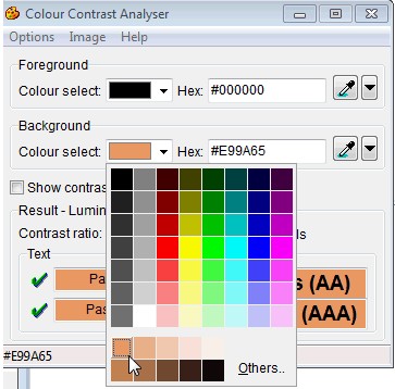
If a company does not have an established color palette, the Index of Color Contrast Samples website displays color combinations that work well with a white background.
Saving infinite defaults as your defaults
Abstract
You can save any Infinite color default as your own default, ensuring that if Infinite changes defaults that your theme colors will remain as you want them.
If you do not explicitly save a color default as your own default, if Infinite changes a color default, your color will also change. For example, if Infinite changes the current teal color palette to green, your color palette will also change to green. If you explicitly save color defaults, your color palette would remain teal.
In a page that contains theme colors (such as Theme Colors), go to the field you want to change (for example, Subnavigation Selected Link Color). For that field, #FFF (white) is the default color.
Reenter the default color (for example, #FFF), and select the Apply button. A message informs you the setting was successfully changed.
Repeat this process for any other color field you want to save.


