Abstract
Product: BrassRing
Client Training and Enablement Session Details
Topic: BrassRing Metrics Dashboard Advanced Functionality
Date: 15 Oct 2019
What’s the difference between Auto req ID and Req ID?
Auto req ID is the unique identifier that is automatically assigned to a Req when a Req is opened or the BR number in BrassRing. Req ID is typically used when a client uses another system to create reqs and then integrates them into BrassRing by using a req import integration. It’s considered a custom req ID assigned by a non-BrassRing application.
Can we select a specific Questionnaire's Question and possibly the answer ( like Yes or No)?
Yes, you can add a question and filter that question by a specific response. The question and/or field must be enabled as searchable and outputable in order for you to select it to appear on a visualization.
Have you ever dealt with an issue where the Metrics Dashboard crashes Internet Explorer and Google Chrome?
Please submit a case to the GSC if you encounter this.
What are the limits of the graphs? Can we have several inputs and fields like when reporting in the reporting tool?
In the Data Insight Tool (DIT), you can have up to 75 fields and 10 filters on a report template. In the Metrics Dashboard, you can have several fields pulled into the visualization. There are no specific limitations at this time but we highly recommend to keep them to a minimum so you do not run into system performance issues and can view all the data you’re looking to see. Larger reports be created in the DIT instead of the Metrics Dashboard.
Can you export the data in the graph?
Yes. All visualizations can be exported; however, only the visualization type of Table is available to export into Excel. All other visualizations can be exported to PDF. The PDF only exports the visualization and not the data behind the visualization.
How is percent calculated? Is it percent of hires compared to applicants in the city, or something else?
If you select Percent it will give you the % of candidates hired in that city. The percent is derived from the total number of hired candidates across all cities.
When filtering, is there a quick way to exclude only one value (without having to select all others except it)?
Not currently. We do have this type of functionality with the HR Statuses but not field options. Engineering and Offering Management will be discussing this internally to determine if we could implement something like this.
Is there a way to have calculations between more than just 2 HR Statuses? I have groups that want to see the amount of days candidates are in status throughout the application process.
Yes, you can do this by adding the fields/HR Status dates, then editing the function to include all of the fields in the calculation. You can also have multiple groups/calculations within a visualization. Because every site is a little different, if you’d like help setting this up please put a case in with our Product Experts and we’ll help come up with something!
If you have multiple offer-accepted dates (e.g. external vs internal), how could you set it up using the sum of both offer accepted dates?
Since "offer accepted" is a HR status, the calculation is done based on the req context. If you have multiple candidates within that req in offer accepted status then the calculation will automatically include all such candidates. This is the initial feedback but if you want to review this in more detail please put a case with our Product Expert team and we can look at your system to see if we can get it configured.
What if a candidate moves to Offer Accepted, then another HR Status, then back to Offer Accepted? Which date will the DATEDIFF use?
The calculation would use the most recent date. If you would like it to use the first date the candidate hit that HR status you would want to pull in the “MIN” function to find the first time the candidate hit that status instead of the last time they hit the status.
What if you wanted to look at the time it takes in status by the month
I think we’d need to investigate this further with you and review the options in the Metrics Dashboard. If you’re interested in setting this up please feel free to create a case with our GSC and our Product Expert team can dig into this visualization within your system.
Is this based on Cand Ref #? What if people share a name?
When you pull the Candidate Name into a visualization it is looking at the individual Talent Records in BrassRing and displaying them as separate values in the metrics. If you are seeing that this is stacking candidates based on Name please open a case with the GSC so we can investigate.
Has anyone seen an issue with table visualizations where adding too many columns will make it display a "There is no data to display" message occasionally?
Re-review your report criteria to ensure correct fields are selected. If you feel like the data selected, please enter a case with the GSC for further assistance. We recommend that large reports are still created in the DIT.
What does the Scale Y-axis do from a data analytics perspective?
Scaling does not have any data implications and will not affect the counts. If scaling is turned off, the height of each bar in the visualization would be relative to other bar values. So a bar chart with a large variation in values ( say 1, 50, 5000, etc), will have a very small bar for 1 and a very large bar for 5000. To avoid this large difference in heights, scaling can be turned on if needed and that will ensure that each bar has minimum visible height. This is especially useful for drill-downs since it may be difficult to click on a very small bar.
We’re in the process of redoing a lot of our reporting. I’m trying to create monthly reports in the metric dashboard. What’s the best way for me to get help with reporting?
Please continue to enter cases with the GSC! Our Product Experts are happy to help walk you through creating visualizations!
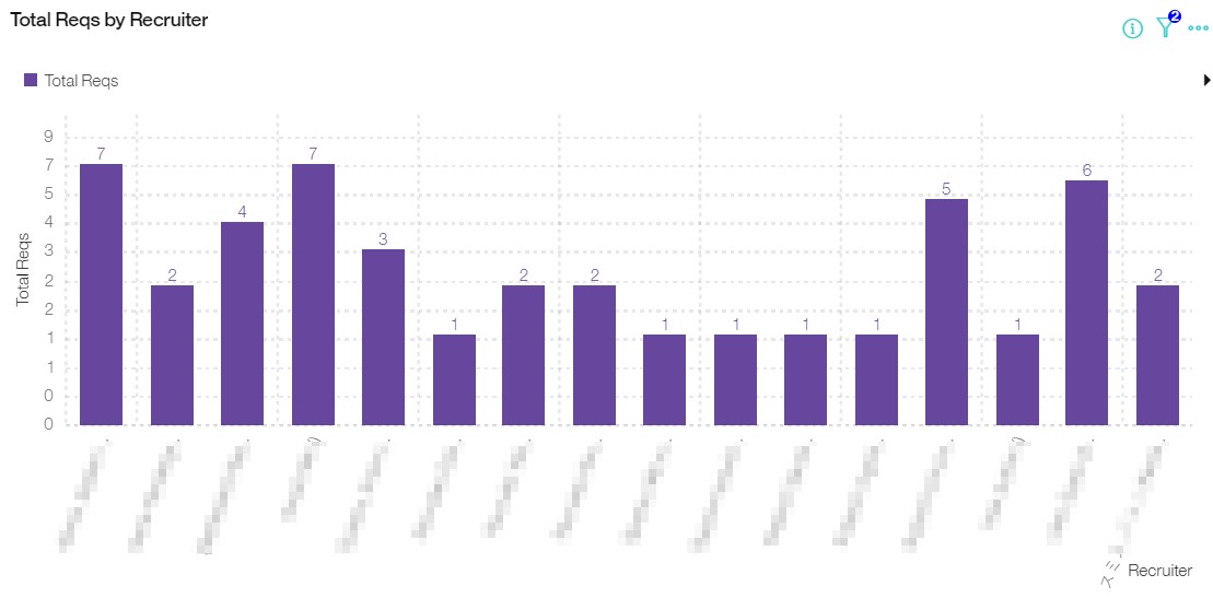
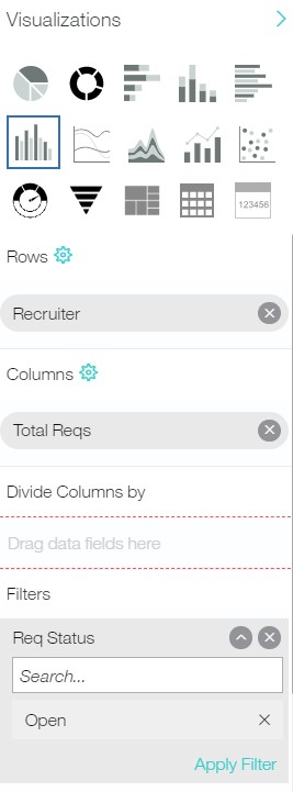
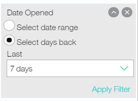
Do you have any example of open requisition by recruiter by week?
If this doesn’t address your question, please reach out and let us know! We’d be happy to work through the set up with you.


