Across Onboard product pages, multiple enhancements are made to provide users and potential employees with a better user experience. Read on to find out more about what has changed.
Tasks Screen - UI Enhancements
The Tasks screen is updated to display the sections as tabs. The drop-down is moved from the sections column to the top of the screen. This provides users with a better experience.
Figure 173. Tasks screen before UI enhancements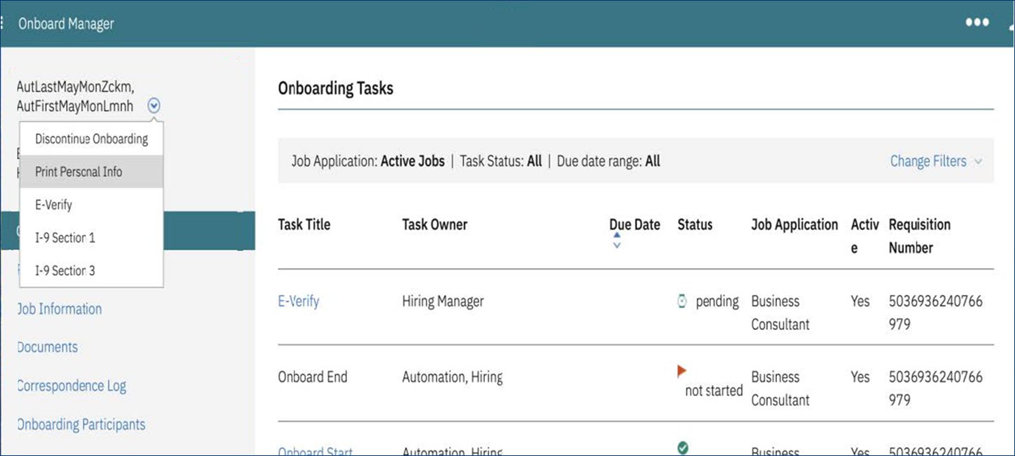
Figure 174. Tasks screen after UI enhancements
Onboarding Tasks - Documents section
The documents section in Onboarding tasks is updated to display various actions related to the documents as separate links instead of a drop-down. This change provides better clarity on the actions that can be taken for the available documents.
Figure 175. Document action options before enhancements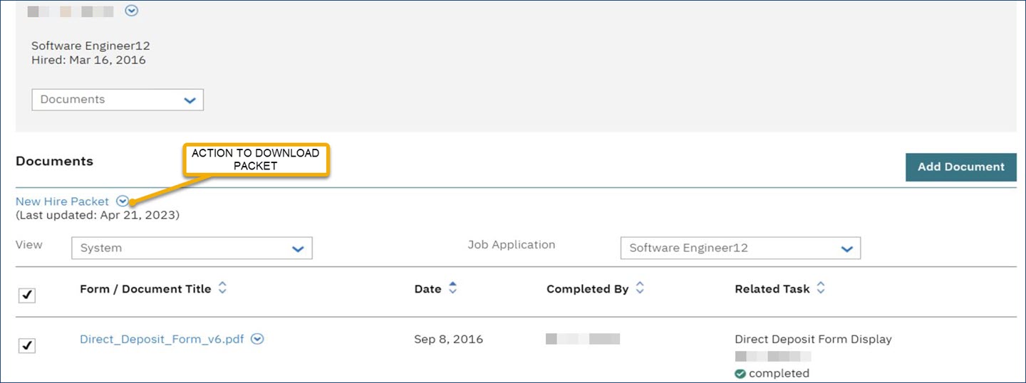
Figure 176. Document action options after the enhancements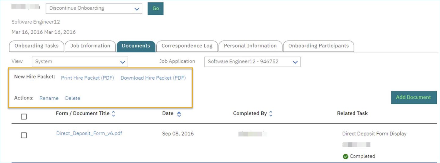
Date Picker - All Screens
Date-related fields present in Onboard are now updated to Date picker fields. Users can input a date by using the date picker instead of manually entering a date. This helps in validating the date entry and also in avoiding inadvertent errors and confusion of the date entry.
Figure 177. Manual entry of dates before the enhancement
Figure 178. Calendar Date Picker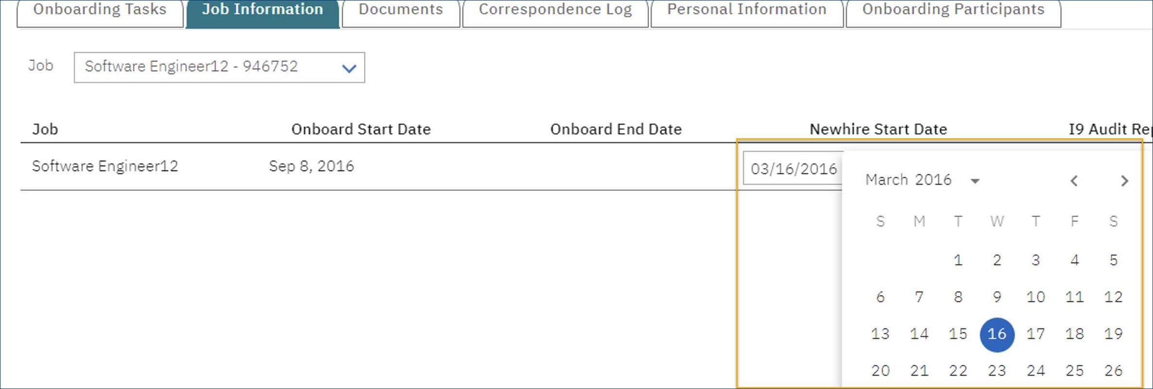
I9 Validations - Error Message Displayed
When a user tries to download an I9 validation report without completing the I9 form, previously an ambiguous code and message were displayed. After the enhancements, an error message with an Ok button is displayed to the user to avoid confusion.
Figure 179. Ambiguous Message upon I9 audit download attempt
Figure 180. Unambiguous Message upon I9 audit download attempt
Manage New Hires - Enhancements
The Manage New Hires screen is enhanced for a better user experience. The filter section is moved and improved.
Figure 181. Manage New Hires screen before enhancements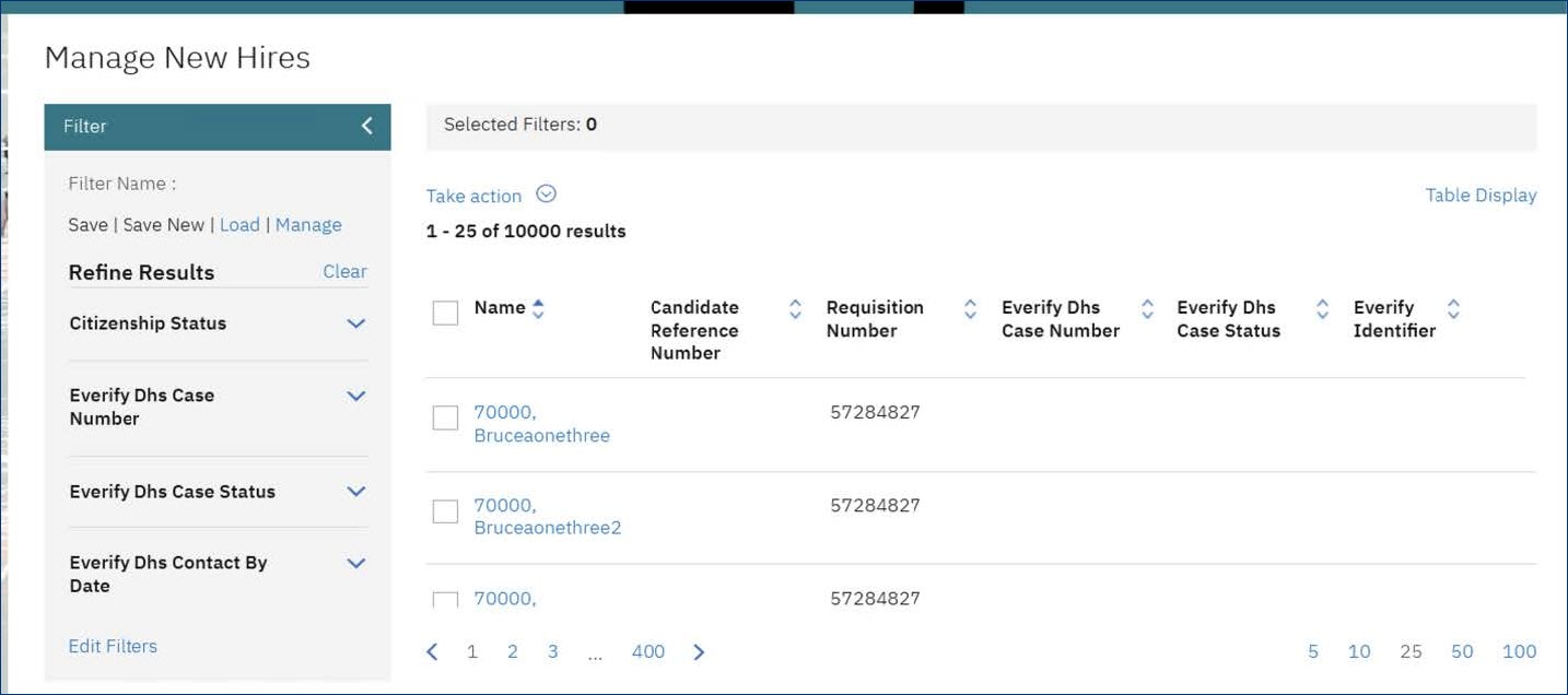
Figure 182. Manage New Hires screen after enhancement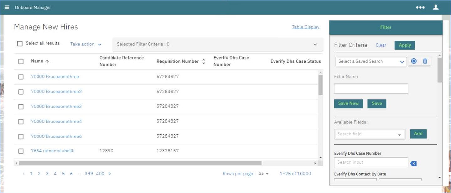
Figure 183. Manage New Hires screen after enhancement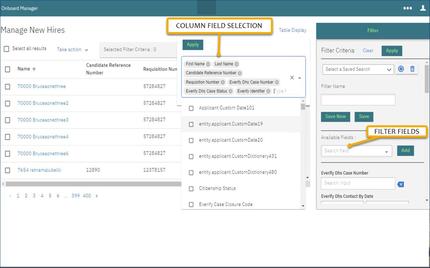 The filter fields and column fields are updated for better user experience.
New Hire Login - Multiple Job Applications
The user used to have multiple links related to respective job applications all spread across the screen. This screen is updated to display the job applications in a drop-down so that it is easier to view and select the job application of the user's choice.
Figure 184. Multiple Job applications before the enhancement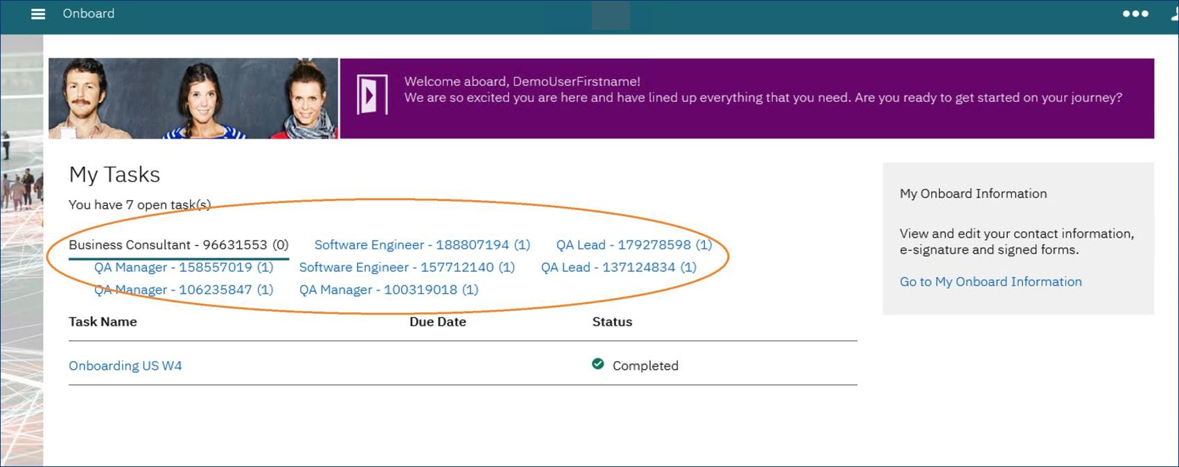 Too many links on the page - not easy on the eye
Figure 185. Multiple Job applications after the enhancement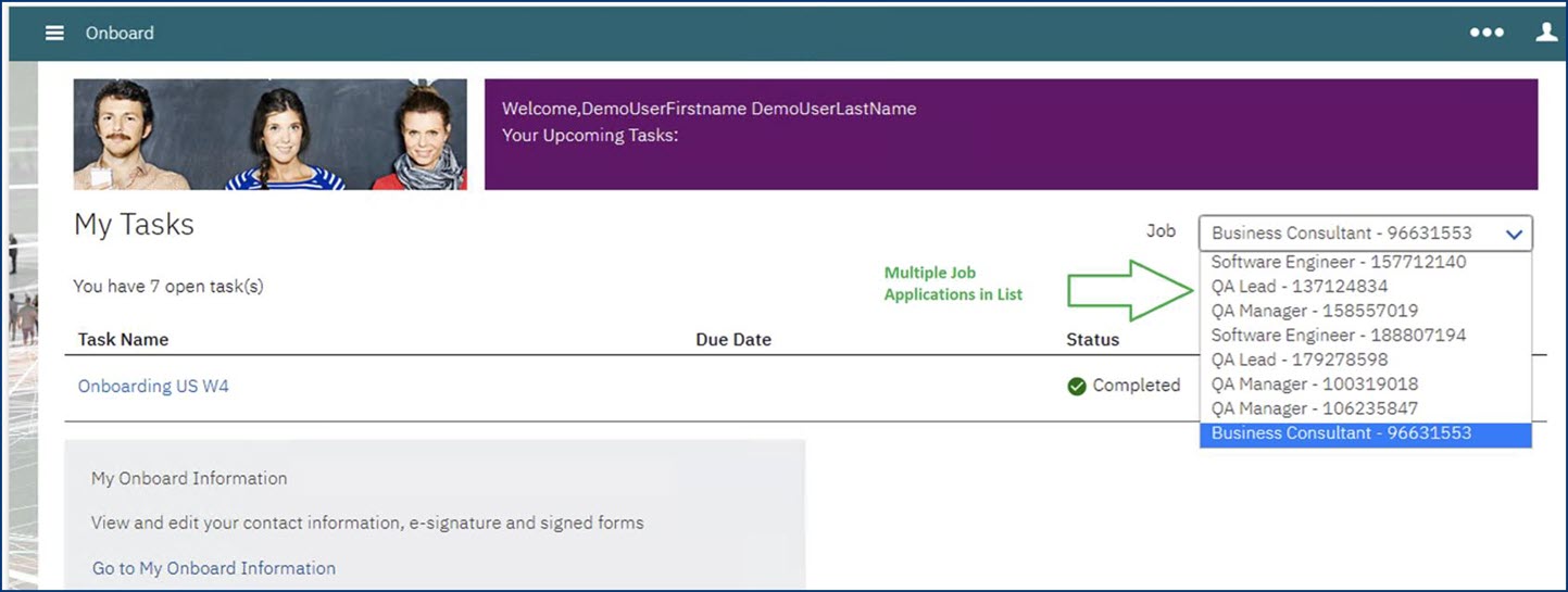 Jobs are easy to locate and the page is not clumsy anymore.